Sand Canyon Residence

Sand Canyon Residence
Our clients had lived in this home for a number of years when they made the decision to add on and renovate. We were brought on board after the architect had completed the plans but before construction began. Like many old homes, this one had its peculiar quirks that made the reno of the existing kitchen a particular challenge. While our client’s styles were fairly complimentary, we worked with them to broaden their approach to design, together creating a sophisticated, contemporary space.
Once we understood the needs and goals of the kitchen space we realized the architect’s layout would not be functional for our client who spends a lot of time in her kitchen. Faced with low ceilings and structural beams that held the floor above, we needed to disguise the structural supports required to remove the existing wall between the existing kitchen and office and hide the plumbing drain lines from the master bathroom above the kitchen. To visually increase ceiling height, we pushed the vertical line of the cabinets wherever we could and used the same soft white paint for the cabinets, walls and ceiling to keep the eye from focusing on the low ceiling and soffits needed to disguise drain lines. The acres of cabinetry and countertops provides ample space for the family gatherings our clients like to host and special care was taken to make sure we designed in access to beverages and plenty of island seating for the client’s many grandsons.
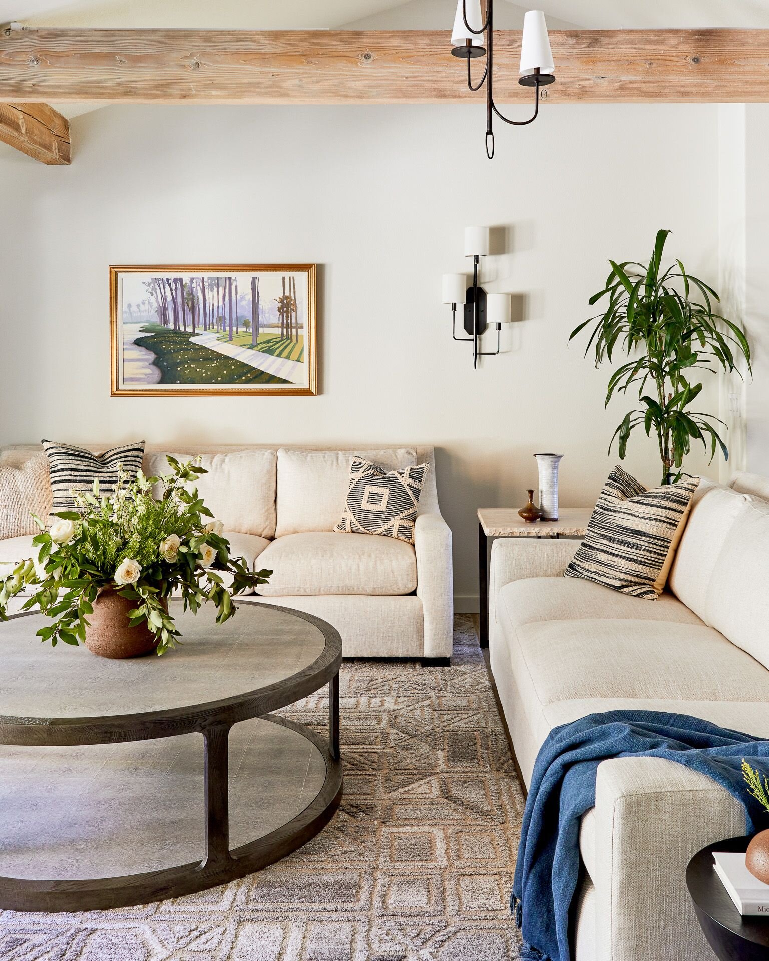
We always consider the connection between rooms when we design. Here, the soft white of the kitchen is carried through to the living room. We selected light neutral fabrics with a lot of texture accented by pops of color in the pillows and the client’s original artwork. We elected not to use window treatments in the living room to allow the eye to drift out into the garden and fountain area knowing that light control was not an issue in that room. Soft lighting installed on top of the beams lights the vaulted ceiling to create wonderful ambiance in the evening.
We selected warmer tones for the built-ins and wallpaper in the office for a masculine feel. The desk provides plenty of room to spread out and printers, paper and supplies are neatly stored out of site.
The materials for the main bath were selected to visually enlarge the space by minimizing contrast. We added just a touch of the traditional in the selection of the wall sconces to soften the very contemporary vanities.